Mobile UX / Research / Product Design
Laurier Link
A mobile wayfinding and resource hub designed to help Wilfrid Laurier students move through campus with less stress and more independence.
01
Project overview
Laurier Link began as a response to a simple campus problem: students were wasting time piecing together directions, office hours, building names, and support resources from separate tools. The app centralizes those moments into one mobile experience that acts like a virtual help desk.
The product goal was to make support feel immediate. Students could search for a class, find a building, save frequent destinations, check service hours, and turn on accessible route guidance — all without needing to know Laurier's internal campus language first.
02
The problem
Laurier's campus life was scattered across multiple platforms — a separate app for events, a static PDF map for navigation, and various social channels for community updates. Students frequently reported frustration and missed opportunities due to this fragmentation.
First-years, commuters, international students, and visitors all struggled with confusing signage, unclear building codes, and fragmented tools like LORIS and MyDegree.
Intuitive wayfinding
Turn-by-turn walking directions to academic buildings, residences, classrooms, and common areas.
Resource shortcuts
Fast access to wellness, advising, library hours, tech support, shuttle schedules, and emergency contacts.
Personalized campus use
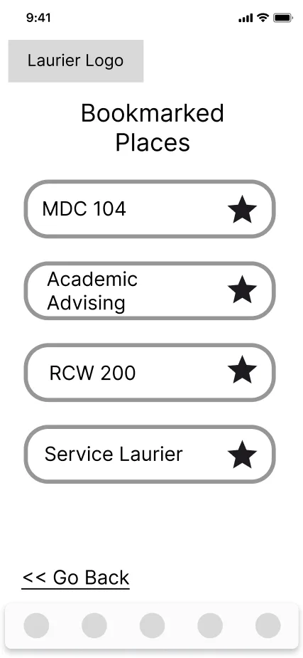
Favorites, nearby event notifications, accessible route filters, and saved destinations for repeat trips.
03
Research
I led user research through interviews, surveys, and journey mapping sessions with students across all years. Their feedback was organized into key themes around signage, digital tools, service discovery, and support preferences.
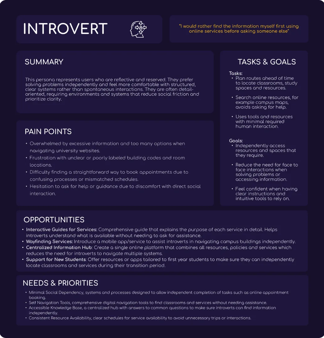
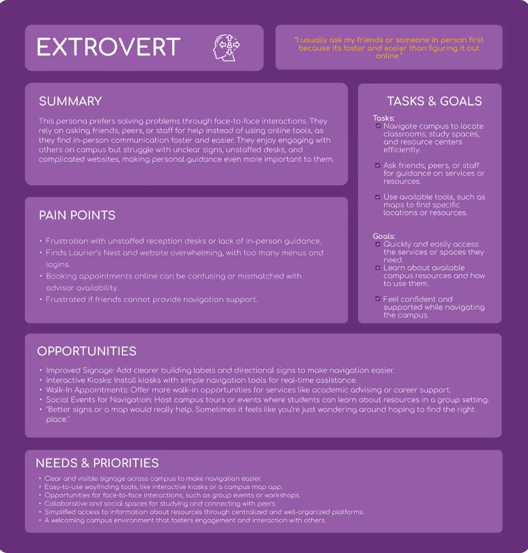
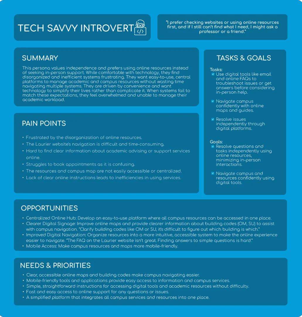
Four key audience groups emerged from the research:
First-year & transfer students
Needed straightforward directions, clear onboarding, and labels that did not assume campus knowledge.
Commuter students
Wanted quick route planning from parking, shuttle stops, and high-traffic campus entry points.
International students
Needed icon-driven navigation, clearer terminology, and optional multilingual support.
Visitors & event attendees
Needed room details, event locations, and visitor resources without requiring a student login.
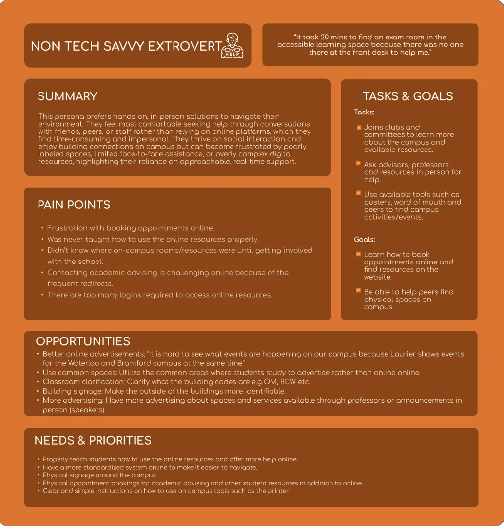
03.5
Personas
From the research I synthesized four distinct personas that captured the needs, frustrations, and goals of Laurier's diverse student body — each representing a key audience segment.
04
Define & ideate
Synthesizing the research led to a clear problem statement and a guiding question that shaped every design decision.
Problem statement
Students at Laurier lacked a single reliable way to find buildings, discover events, and access campus services — especially outside regular hours when in-person support was unavailable.
How might we
How might we create an accessible, centralized mobile experience that helps students navigate campus, discover opportunities, and feel connected — so they can move through university life with confidence and independence?
05
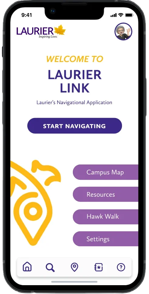
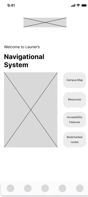
Product direction
I iterated through low-fidelity wireframes to high-fidelity prototypes in Figma, testing each round with students. The core features address the three pillars of wayfinding, resource access, and personalization.
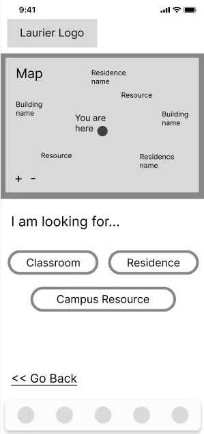
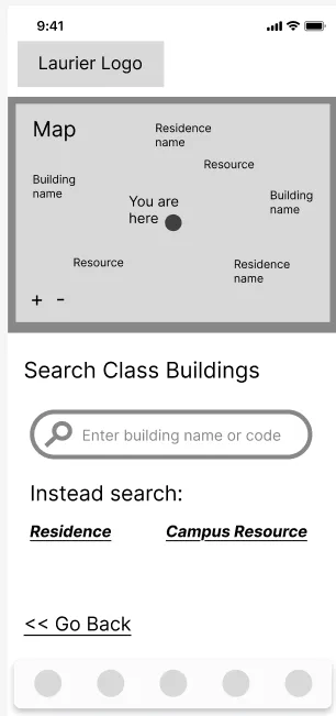
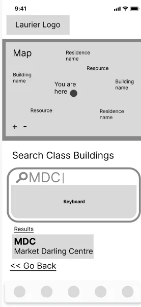
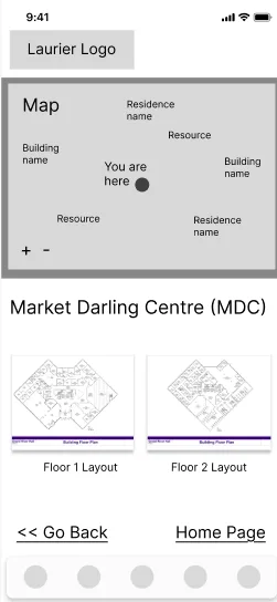
Find My Class
A prominent search flow with autocomplete suggestions, recent searches, and building results that can be saved for quick access.
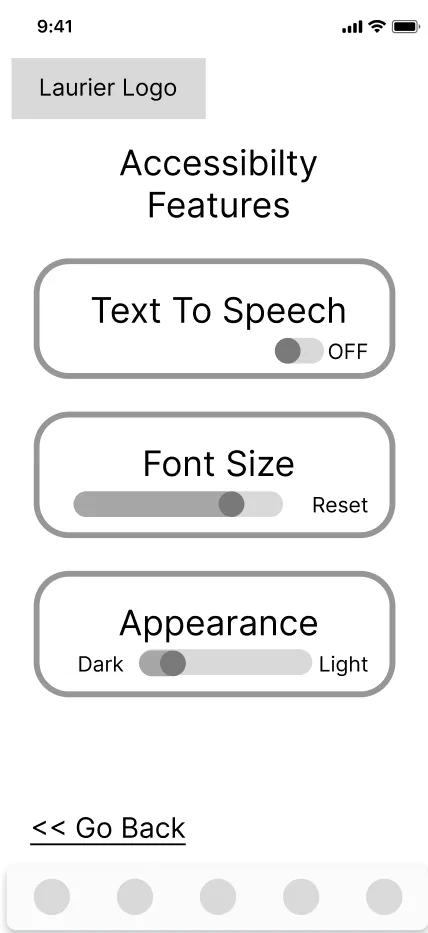
Accessible routes
A visible toggle highlights ramps and elevators, with route adjustments available when a path is blocked.
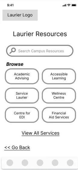
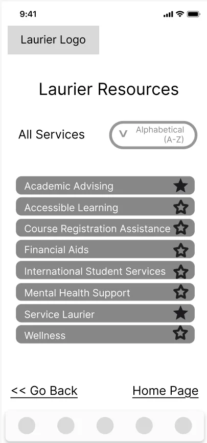
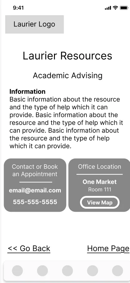
Service directory
Cards for campus services show hours, location, contact actions, and plain-language service descriptions.
Favorites & personalization
Students can save classrooms, study spaces, and service desks to reduce repeat searching and build their own campus.
06
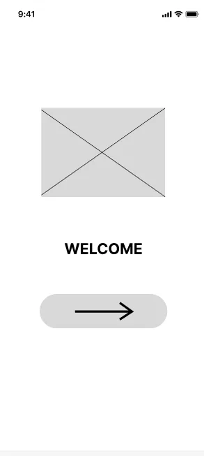
Prototype & testing
Early wireframes explored a kiosk-style digital secretary, but testing showed that a mobile-first app better matched student behavior. Students needed help while walking, commuting, and arriving outside desk hours.
Two usability rounds focused on locating a building, toggling accessible routes, saving a route, and finding a campus service. Feedback led to larger tap targets, clearer labels, visible hours, a persistent back button, live search suggestions, and a stronger accessibility toggle.
Try it out on Figma
This embedded prototype preserves the original Figma screens, transitions, and clickable flows exactly as designed.
08
My angle
I approached Laurier Link as more than a navigation tool. The real opportunity was to reduce directional anxiety and give students a sense of control on campus. Every decision, from the Favorites row to accessible routing, was grounded in research and shaped around independence.
The final concept balances student needs with institutional realities: it centralizes support, reduces repeated service questions, and gives Student Services a more sustainable way to guide students beyond front-desk hours.
View more projects