Healthcare UX / Accessibility / Product Design
St. Joseph's Healthcare
Transforming the patient portal into a compassionate, accessible tool for managing care — from appointments to wayfinding.
01
Project overview
St. Joseph's Healthcare serves a diverse patient population across multiple sites. Their existing patient portal was functional but overwhelming — dense menus, clinical language, and poor mobile responsiveness left many patients feeling anxious rather than informed.
The brief was to redesign the portal with accessibility and emotional wellbeing at the centre — making it easier for patients to manage appointments, navigate the hospital, and access their care information in a way that feels supportive, not clinical.
02
The problem
Patients struggled with three core friction points: appointment management was confusing with no clear reschedule flow and buried details, hospital wayfinding was stressful causing missed appointments, and the overall tone felt clinical and cold rather than supportive.
Users with visual impairments or cognitive disabilities faced additional barriers. The portal was not meeting the needs of the very people it was designed to serve, and staff were spending significant time helping patients navigate the system.
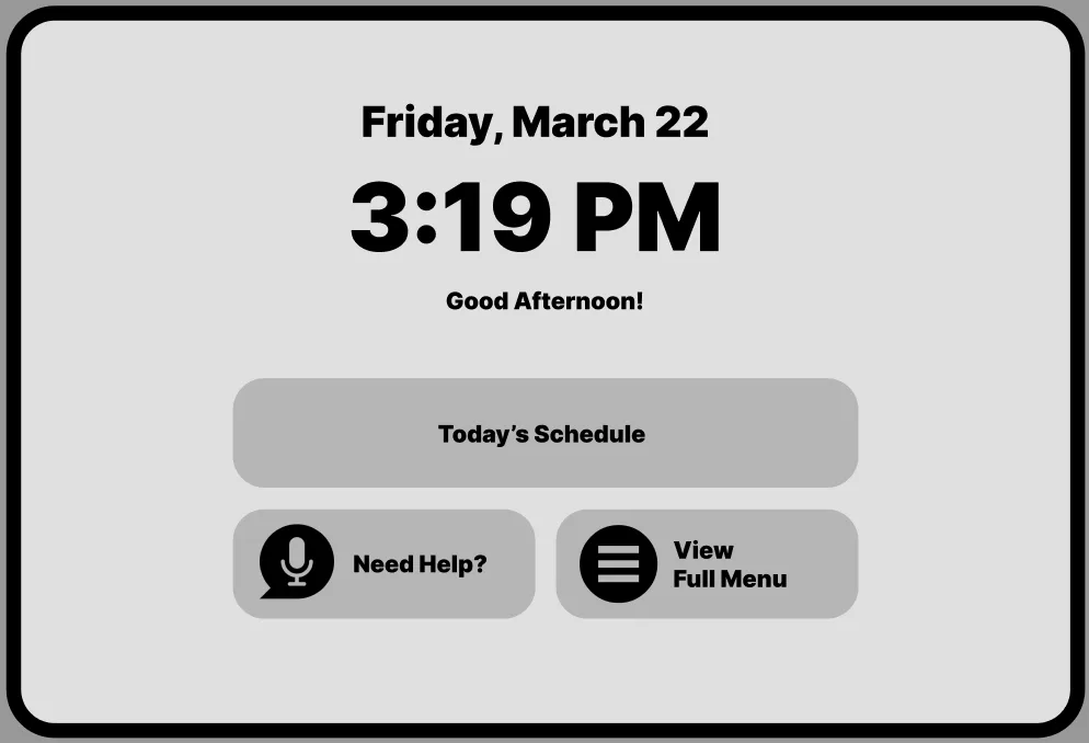
Simplify appointments
One-tap book, reschedule, or cancel with clear prep instructions and real-time wait estimates.
Reduce anxiety
Warm, plain-language tone throughout. Step-by-step guidance for every task, from booking to check-in.
Accessibility first
WCAG 2.1 AA compliance with adjustable text sizing, high contrast mode, and screen reader optimisation.
03
Research
I conducted contextual inquiry, journey mapping, and usability testing with 45+ patients and healthcare staff across multiple cohorts. Journey maps revealed emotional highs and lows — from the anxiety of booking a procedure to the relief of finding a parking spot.
Four key user groups emerged from the research:
Elderly patients
Needed larger text, simplified navigation, and voice-assisted options for those with limited mobility or vision.
Chronic care patients
Wanted easy access to appointment history, medication lists, and direct messaging with care teams.
Healthcare staff
Needed a streamlined view of patient schedules and the ability to guide patients through the portal during visits.
First-time visitors
Struggled with wayfinding across multiple buildings, parking, and entrances — especially during emergencies.
04
Define & ideate
Synthesizing the research led to a clear problem statement and a guiding question that shaped every design decision.
Problem statement
Patients at St. Joseph's Healthcare lacked a portal that felt supportive and accessible — dense clinical language, poor mobile responsiveness, and confusing navigation left patients anxious rather than informed.
How might we
How might we redesign the patient portal to feel compassionate and clear, so that every patient — regardless of ability or familiarity with technology — can manage their care with confidence and dignity?
05
Product direction
I facilitated co-design workshops with patients, nurses, and administrators to ensure every voice shaped the solution. The features that emerged centre on clarity, warmth, and universal access.
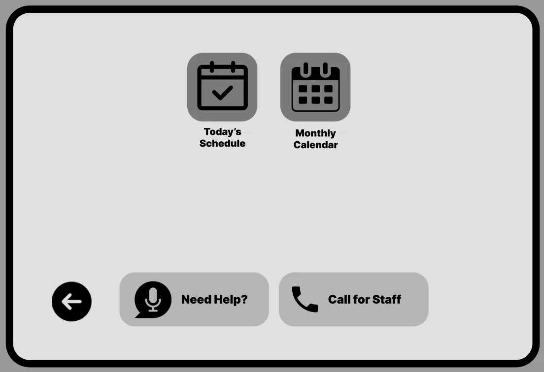
Streamlined appointments
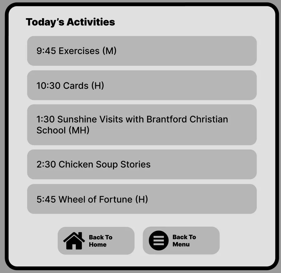
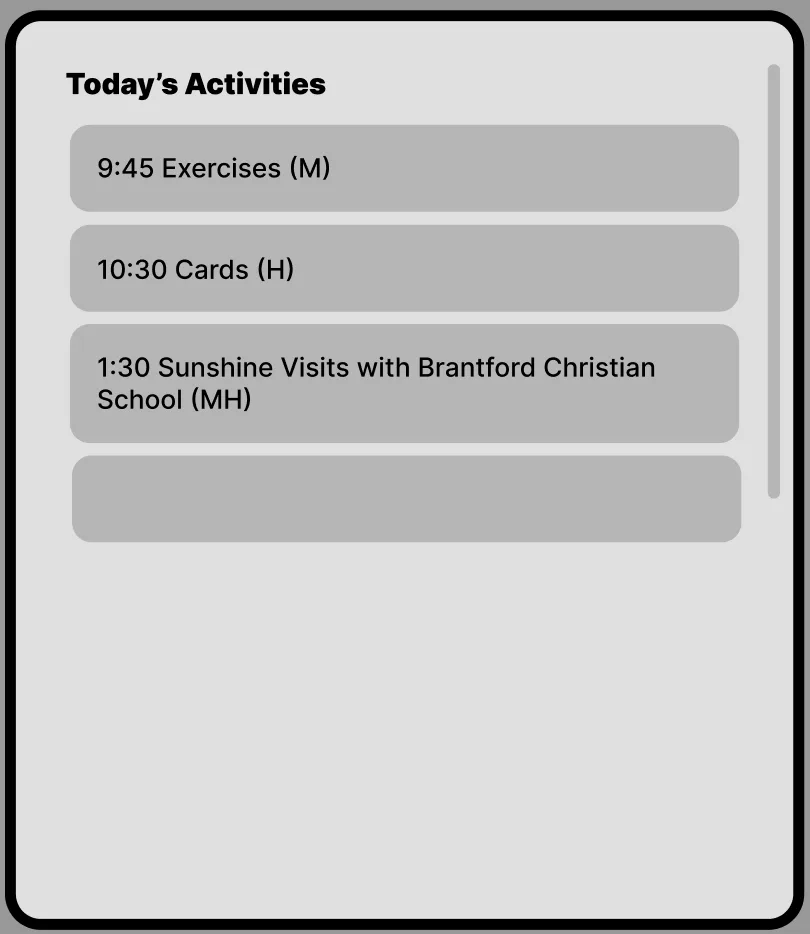
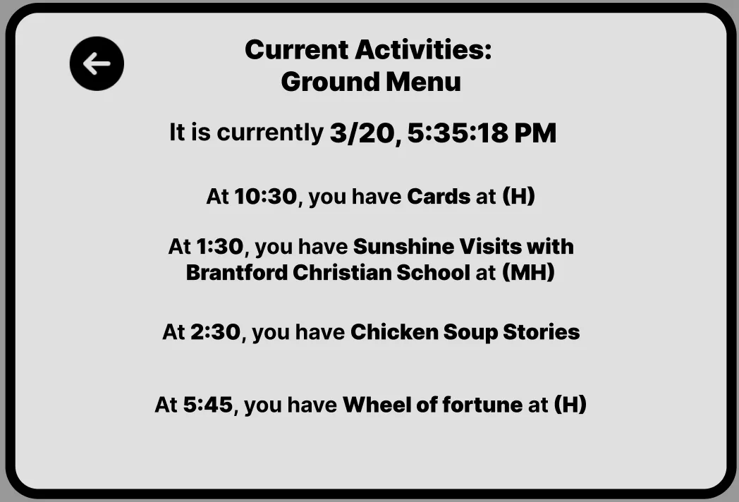
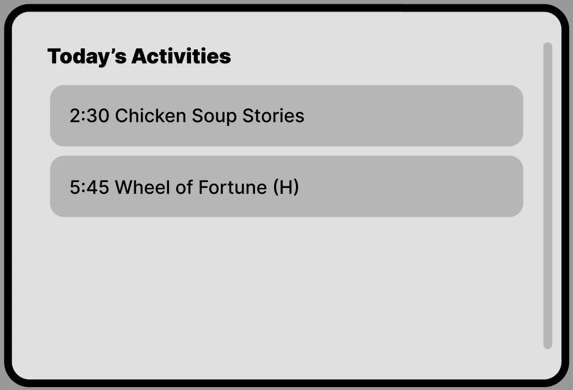
One-tap book, reschedule, or cancel. Clear prep instructions and real-time wait estimates so patients know what to expect.
Compassionate wayfinding
Step-by-step indoor navigation with parking, elevator, and accessibility route options tailored to each hospital site.
Voice assistant integration
Hands-free appointment booking and information retrieval for users with limited mobility or visual impairments.
Accessibility-first design
WCAG 2.1 AA compliant with adjustable text sizing, high contrast mode, and screen reader optimisation throughout.
06
Prototype & testing
Early concepts were tested as paper prototypes with patient focus groups, then iterated into high-fidelity Figma prototypes. Two rounds of moderated usability testing focused on appointment booking, wayfinding tasks, and emergency alert interactions.
Key findings led to a simplified information architecture, larger touch targets for elderly users, added voice navigation for hands-free use, and a warmer visual tone with illustrations and reassuring microcopy throughout the journey.
Try it out on Figma
This embedded prototype preserves the original Figma screens, transitions, and clickable flows exactly as designed — from appointment booking to accessible wayfinding and voice interaction.
07
Outcome
The redesigned portal raised emergency alert success rates from 52% to 92%, reduced appointment no-shows by 25%, and improved cross-team coordination by 40%. The voice assistant feature was particularly impactful for elderly and mobility-impaired users, receiving the highest satisfaction scores in post-launch surveys.
This project reinforced my belief that accessible design is better design for everyone. When we design for the edges — elderly users, visually impaired patients, non-native speakers — we create experiences that are clearer, warmer, and more effective for all.
View more projects