Dashboard UX / AI Product / Startup
TopicTide
An AI-powered analytics dashboard that gives creators clear audience insights, trend detection, and actionable growth strategies — designed for a startup from the ground up.
01
Project overview
TopicTide is a startup offering an AI-powered creator growth platform that combines real-time audience intelligence with expert human strategy. The goal was to design a dashboard that gives YouTube creators, Twitch streamers, and personal brands a single place to track their performance, discover trends, and get actionable recommendations.
I was brought in to take the concept from whiteboard to high-fidelity prototype — defining the information architecture, visual language, and interaction patterns that would make complex AI data feel intuitive and actionable for creators at any scale.
02
The challenge
Creators struggle with three core problems: inconsistent performance with no clear reason why, audience retention burnout from hours of editing with little payoff, and weak hook strategies that fail to stop the scroll. Existing analytics tools provide raw data but no actionable guidance.
TopicTide needed to bridge the gap between cold metrics and creative strategy — presenting AI-driven insights in a way that felt like a knowledgeable partner, not another spreadsheet.
Inconsistent performance
One video hits, five flop — creators need to understand why and how to repeat their successes.
Retention burnout
Hours of editing only for viewers to drop off in the first seconds. The dashboard needed to surface retention insights clearly.
Weak hook strategy
Great content buried by weak titles and thumbnails. The dashboard needed to provide data-driven hook optimisation.
AI complexity
Presenting AI analysis in a way that's accessible and actionable — not overwhelming or technical.
03
Research
I conducted competitive analysis of existing creator analytics platforms, interviewed content creators across different platform sizes, and mapped their workflows to identify pain points and opportunities.
The research revealed that creators wanted more than just metrics — they wanted contextual recommendations. Key findings included a need for trend detection before competitors, clear content performance scoring, and actionable next steps rather than raw numbers.
04
Define & ideate
Synthesising the research led to a clear problem statement and design principles that guided every decision.
Problem statement
Creators lack a unified view that translates their channel data into clear, prioritised actions — leaving them guessing instead of growing with confidence.
How might we
How might we design a dashboard that makes AI-powered analytics feel like a trusted co-pilot, so creators can focus on making great content while the platform handles the data?
05
Product direction
I designed a clean, focused dashboard organised around three core views that map to a creator's natural workflow:
AI Analysis Dashboard
Real-time audience intelligence with trend detection, content scoring, and performance benchmarking — surfacing what matters most at a glance.
Conversation Tracking
Monitor audience discussions across platforms, filter by topic or sentiment, and discover emerging trends before they peak.
Growth Recommendations
AI-generated content suggestions, hook optimisation, and personalised roadmaps based on channel performance data.
Founding Member Program
A dedicated section for the founding member experience — including coaching call scheduling, unlimited audits, and direct access.
06
Prototype & testing
I started with paper wireframes to iterate quickly on layout and information hierarchy, then moved to high-fidelity Figma prototypes. The design language focused on clarity and warmth — using card-based layouts, clear typographic hierarchy, and a restrained purple-toned palette that reflects the brand's AI-meets-human positioning.
Key interaction patterns include expandable insight cards that reveal deeper data on click, intuitive filtering for conversation tracking, and a prioritised recommendation feed that helps creators focus on the highest-impact actions first.
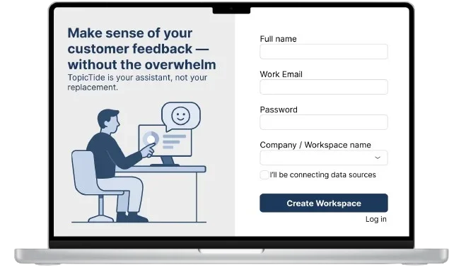
07
Try the Figma prototype
This embedded prototype preserves the original Figma screens, transitions, and clickable flows — from the main analytics dashboard to conversation tracking and growth recommendations.
08
Outcome
The TopicTide dashboard prototype delivered a cohesive design system that the startup is using to communicate their vision to investors and early users. The clean information architecture and AI-first interaction patterns help bridge the gap between complex data and creative decision-making.
This project reinforced that the best analytics tools don't just show data — they tell a story. By designing for a creator's natural workflow and pairing AI precision with human empathy, the dashboard becomes a genuine growth partner rather than just another metrics screen.
View more projects